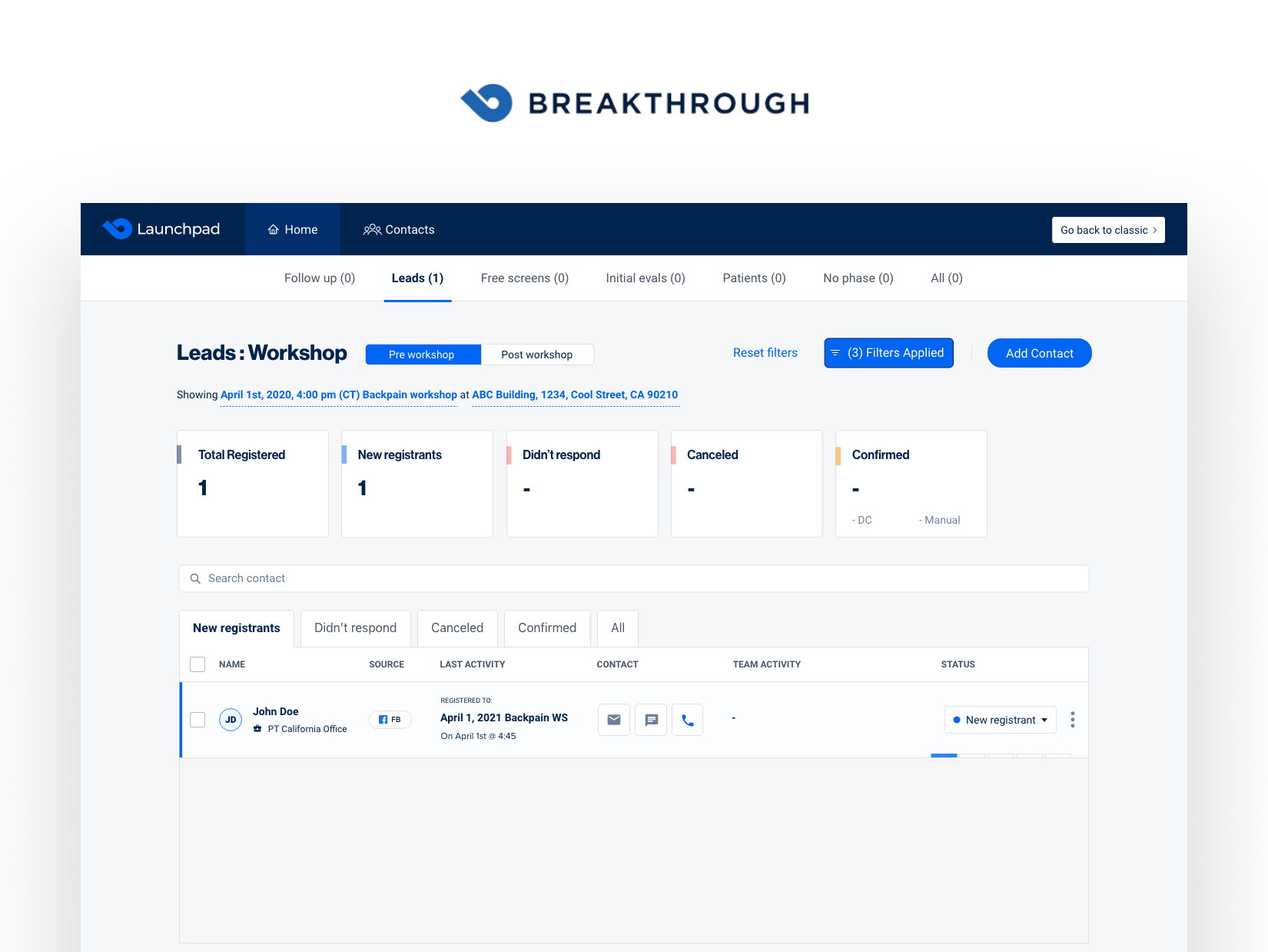


Breakthrough is changing the game in the healthcare sector with a comprehensive software solution designed for physical therapists and chiropractors. The platform serves as a one-stop-shop for marketing campaign management, lead coordination, email automation, and insightful reporting. It’s designed to streamline operations and facilitate smoother communication between healthcare professionals and patients, making the process more efficient and cohesive.
In close collaboration with the Breakthrough product team, which included seasoned professionals with backgrounds at companies like Facebook, we took the helm in the platform’s redesign. Guided by Peter Perez Jr, our approach mirrored the strategy implemented in the Rasa project. Here’s a more friendly take on our process:
We kicked off with lively brainstorming sessions, fostering a hub of creativity and fresh ideas inspired by Jake Knapp’s iterative design process.
We rolled up our sleeves to dig deep into user preferences and behaviors, shaping a platform that truly vibes with its audience.
We created user flows that make navigation a breeze, enhancing the user’s journey through the platform.
Set the stage with wireframes that mapped out a visually appealing and robust platform, creating a blueprint for success.
We brought the wireframes to life with detailed designs that married functionality with a pleasing aesthetic, all while maintaining a user-friendly interface.
We brought the wireframes to life with detailed designs that married functionality with a pleasing aesthetic, all while maintaining a user-friendly interface.